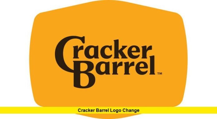
The cracker barrel logo change has become one of the most talked-about brand decisions of the year. Just days after launching a sleek, text-only design that removed the company’s well-known “Old Timer” mascot, Cracker Barrel announced it would be restoring the classic logo following heavy backlash from loyal customers.
The rebrand was originally presented as part of a modernization effort to refresh the brand’s image and appeal to younger generations. However, the decision to remove the illustrated figure many customers associate with tradition and Americana was met with swift criticism. Social media quickly lit up with negative reactions, with thousands of customers voicing disappointment over the disappearance of the rustic logo they had come to love.
Key Points Summary
(For quick readers, here are the essentials at a glance)
- New logo unveiled: Minimalist text-only design replaced “Old Timer.”
- Immediate backlash: Customers voiced frustration, citing loss of tradition.
- Stock impact: Shares fell sharply following rollout.
- Reversal: Classic logo reinstated within days.
- Company response: Leaders emphasized that values of hospitality remain unchanged.
Customer Reactions and Public Backlash
For many, the change was more than cosmetic. Customers felt the brand was moving away from its roots of country charm, family values, and Southern heritage. The removal of the “Old Timer” character symbolized, in their eyes, a detachment from the authenticity that made Cracker Barrel unique.
Online polls and informal surveys revealed that a significant number of diners were less likely to visit following the redesign. Some critics labeled the move “soulless” and accused the company of abandoning its identity in pursuit of modern trends.
This reaction sparked widespread discussion, with even political figures and cultural commentators weighing in, further amplifying the controversy.
Financial Impact
The logo rollout also affected investor confidence. Shares of Cracker Barrel dropped noticeably in the days after the new branding was revealed. This downturn reflected growing concerns about the chain’s connection to its core customer base and whether the modernization strategy was misaligned with customer expectations.
Once the company announced it would revert to the original logo, shares rebounded, regaining much of the lost ground. Analysts noted this was a rare instance where customer sentiment translated almost instantly into market movement.
The Company’s Response
Cracker Barrel executives acknowledged the backlash and announced that the traditional logo would be restored immediately. In their statement, they thanked customers for their passion and loyalty, emphasizing that the company’s values remain the same: warm hospitality, home-style food, and a welcoming environment.
The leadership team clarified that while store renovations and menu updates would continue, the brand’s most iconic imagery would remain intact. The decision highlighted the importance of balancing modernization with tradition in a business built on nostalgia.
Lessons for Branding
The cracker barrel logo change has quickly become a textbook case of how brand identity can shape customer loyalty. While many companies successfully update logos to keep up with design trends, heritage brands must tread carefully.
The episode underlines a critical truth: customers often form emotional connections to visual symbols. When those connections are disrupted, even the best-intentioned rebrands can backfire.
Cracker Barrel’s reversal shows that while companies can evolve in terms of food, décor, and digital presence, certain elements—like the familiar logo—remain untouchable in the eyes of customers. For now, the “Old Timer” mascot continues to symbolize comfort, tradition, and the timeless appeal that keeps families returning.
What are your thoughts on this bold logo experiment and the quick turnaround? Share your opinion below—do you think Cracker Barrel made the right call?
